What is SweetAlert2 and Why Use It?
SweetAlert2 is a lightweight JavaScript library that replaces the browser’s default alert(), confirm(), and prompt() dialogs with modern, customizable, and good-looking popups.
Instead of the plain, dated native dialogs that feel like they belong to the 90s, SweetAlert2 gives you clean animations, icons, flexible layouts, and full control over styling — all without forcing you to pull in a heavy UI framework.
Here’s why developers actually reach for it in real projects:
- Looks professional out of the box (success, error, warning, info, question icons built-in)
- Easy to customize title, text, buttons, colors, even HTML content inside the popup
- Supports promises, so you can write clean async/await code when waiting for user input
- Tiny footprint — usually loaded via CDN in under 20 KB gzipped
- Works perfectly on plain HTML + vanilla JS pages, no React/Vue/Angular required
Installation – Two Easy Ways
To begin a project, you can insert SweetAlert2 in two ways, the second one is the best and most usual:
Option 1: Using CDN (Recommended for Quick Start)
Just add this fragment in the header section of your project:
<script src="https://cdn.jsdelivr.net/npm/sweetalert2@11"></script>Option 2: Downloading Files Locally
If you have node, just go to the folder of your project and type this command in cmd:
npm install sweetalert2Your First SweetAlert2 – Replacing window.alert()
Your First SweetAlert2 – Replacing window.alert()
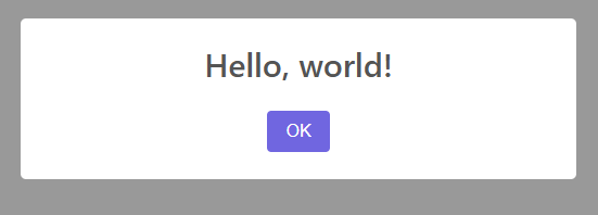
The quickest way to feel the difference is to swap a classic alert() for SweetAlert2.
Here’s the before-and-after in the simplest possible way.
Old-school version (native alert):
<button onclick="alert('Hello, world!')">Click me</button>It works, but it blocks the entire page, looks dated, and offers zero styling control.
Same thing with SweetAlert2:
First, add the CDN links in your <head> (this is the fastest way to start):
<script src="https://cdn.jsdelivr.net/npm/sweetalert2@11"></script>Now replace the native alert:
<button onclick="showAlert()">Click me</button>

<script>
  function showAlert() {
    Swal.fire('Hello, world!');
  }
</script>That’s it. One function call: Swal.fire().
You can make it slightly more readable by adding a title and message:
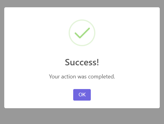
Swal.fire({
  title: 'Success!',
  text: 'Your action was completed.',
  icon: 'success'
});Or keep it ultra-minimal when you just need a quick message:
Swal.fire('Done!');Key differences you’ll notice immediately:
- Non-blocking by default (the page stays interactive while the dialog is open)
- Built-in success/error/info/warning/question icons
- Smooth fade-in/out animation
- Responsive and mobile-friendly out of the box
- Buttons are nicely styled (no more ugly gray native buttons)
This single replacement already makes most small projects feel more polished. From here you can start layering on options like custom buttons, timers, or input fields — but for your very first step, this is the exact pattern most developers use to get hooked on SweetAlert2.
Basic Alert Types (Success, Error, Warning, Info, Question)
Basic Alert Types (Success, Error, Warning, Info, Question)
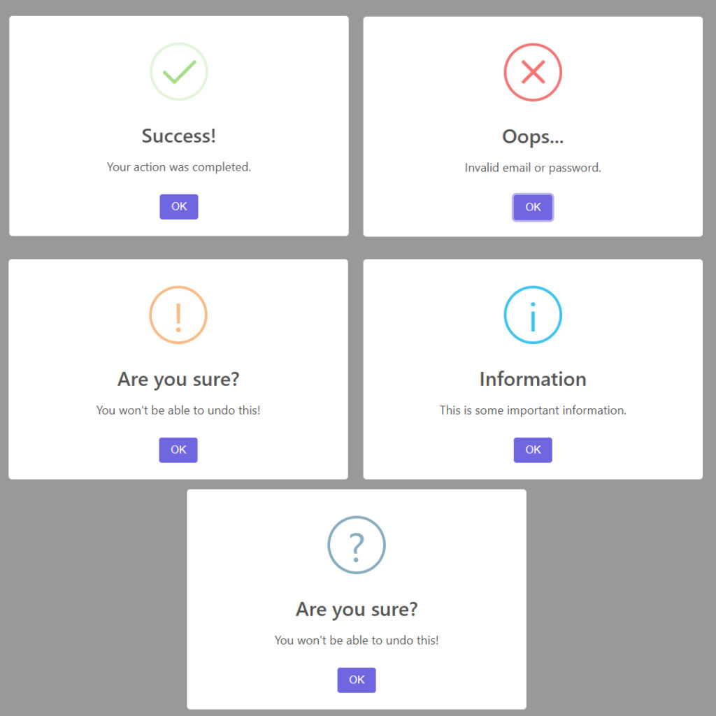
SweetAlert2 comes with five built-in icon types that cover most common feedback scenarios. You set them with the icon option, and the library handles the color, symbol, and styling automatically.
Here are the practical ways to use each one:
// Success – green checkmark, positive feedback
Swal.fire({
  title: 'Great!',
  text: 'Your profile has been updated.',
  icon: 'success'
});

// Error – red X, something went wrong
Swal.fire({
  title: 'Oops...',
  text: 'Invalid email or password.',
  icon: 'error'
});

// Warning – yellow triangle, proceed with caution
Swal.fire({
  title: 'Are you sure?',
  text: "You won't be able to undo this!",
  icon: 'warning'
});

// Info – blue circle with i, neutral information
Swal.fire({
  title: 'Did you know?',
  text: 'This feature is available on all plans.',
  icon: 'info'
});

// Question – blue question mark, asking for confirmation or input
Swal.fire({
  title: 'Quick question',
  text: 'Would you like to receive our newsletter?',
  icon: 'question'
});You can also skip the title and text if you want something even shorter:
Swal.fire('Saved!', '', 'success');          // just title + icon
Swal.fire('', 'Operation failed.', 'error'); // just message + iconThese five icons are the ones you’ll use 95% of the time. They’re instantly recognizable, mobile-friendly, and require zero custom CSS to look good.
For reference, the official list of icons (and a few more advanced ones) is in the docs: https://sweetalert2.github.io/#icons
Customizing Your Alerts
Adding Confirm and Cancel Buttons
To turn a simple alert into something interactive, add confirm and cancel buttons with the showConfirmButton and showCancelButton options. This is where SweetAlert2 starts replacing confirm() in a much nicer way.
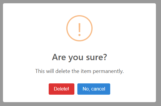
Basic example with both buttons:
Swal.fire({
  title: 'Are you sure?',
  text: "This will delete the item permanently.",
  icon: 'warning',
  showCancelButton: true,
  confirmButtonColor: '#d33',
  cancelButtonColor: '#3085d6',
  confirmButtonText: 'Delete!',
  cancelButtonText: 'No, cancel'
});You can tweak colors, text, and even add a reverse button order with reverseButtons: true if you want the dangerous action on the right (common UX pattern).
Confirmation Dialogs (Yes/No Style)
For classic yes/no decisions, set showCancelButton: true and handle the user’s choice with .then(). This is the pattern you’ll use most often for destructive actions.
Swal.fire({
  title: 'Delete this post?',
  text: "You won't be able to recover it!",
  icon: 'warning',
  showCancelButton: true,
  confirmButtonText: 'Yes, delete',
  cancelButtonText: 'No, keep it'
}).then((result) => {
  if (result.isConfirmed) {
    // User clicked Yes
    deletePost(); // your function here
    Swal.fire('Deleted!', 'Your post has been removed.', 'success');
  }
});Or with async/await for cleaner code:
const { isConfirmed } = await Swal.fire({
  title: 'Are you sure?',
  icon: 'question',
  showCancelButton: true,
  confirmButtonText: 'Yes'
});

if (isConfirmed) {
  // proceed
}Simple Toast Notifications
Toast notifications are perfect for non-intrusive feedback: “Saved successfully”, “Copied to clipboard”, “Session expired”, etc. SweetAlert2 calls them toasts and they behave differently from regular dialogs — no blocking, auto-dismiss, and they stack nicely in a corner.
The key is to use the toast: true option and position them (usually ‘top-end’ for top-right).
Basic toast example:
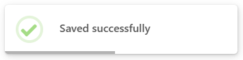
Swal.fire({
  toast: true,
  position: 'top-end',
  icon: 'success',
  title: 'Saved successfully',
  showConfirmButton: false,
  timer: 3000,
  timerProgressBar: true
});You can change the position where the toast appears changing the position value to: ‘top’, ‘top-start’, ‘top-end’, ‘center’, ‘center-start’, ‘center-end’, ‘bottom’, ‘bottom-start’, or ‘bottom-end’.
A few practical variations you’ll actually use:
// Quick success toast
Swal.fire({
  toast: true,
  position: 'top-end',
  icon: 'success',
  title: 'Profile updated',
  showConfirmButton: false,
  timer: 2000
});

// Error toast with longer visibility
Swal.fire({
  toast: true,
  position: 'top-end',
  icon: 'error',
  title: 'Failed to upload file',
  showConfirmButton: false,
  timer: 4000
});

// Info toast without timer (stays until clicked)
Swal.fire({
  toast: true,
  position: 'bottom-end',
  icon: 'info',
  title: 'New message received',
  showConfirmButton: false
});Here are some real examples of how these toasts look in action on different backgrounds:
A few quick tips that save headaches:
- Always set
showConfirmButton: falsefor toasts - Use
timer(in ms) for auto-dismiss timerProgressBar: trueadds a nice progress line- Toasts stack automatically when multiple fire quickly
Toasts are one of the most reused SweetAlert2 patterns in production apps because they feel lightweight and modern without any extra CSS work.
Wrapping Up
SweetAlert2 takes one of the most boring parts of web development — user feedback dialogs — and turns it into something clean, modern, and actually pleasant to look at. Starting from a simple CDN include, you can replace every alert(), confirm(), and prompt() in your project with better-looking alternatives in minutes.
The real win comes when you combine the basics (icons and titles) with practical patterns: confirmation dialogs for destructive actions, quick toasts for non-blocking messages, and occasional input prompts when you need user data without leaving the page.
It’s lightweight, dependency-free, and works perfectly on static HTML pages or small vanilla JS apps. No build step, no framework lock-in — just drop it in and go.
Next time you’re tempted to use the native dialog, give SweetAlert2 a shot instead. Your users (and future you maintaining the code) will thank you.